Kashoo 2.0 is a cloud-based accounting solution that helps small business owners automate bookkeeping tasks which leaves business owners more time running their businesses and less on figuring out expenses.
Tools Used:
Sketch, Figma, Adobe Xd, Zeplin, HTML/CSS, Github, Pen & Paper
Skills:
UX/UI Design, Visual Design, User Testing, Wireframe, QA Testing, Minor Front-end Developer
https://www.kashoo.com/
My Contribution:
- Conducted Interviews with existing Kashoo Classic customers to understand their concerns and comments in order to redesign the experience Kashoo 2.0
- In the process of redesigning the mobile app to simplify the functionality and how users behave interacting with the phone versus the web.
- Redesigned and helped launch Kashoo 2.0 with a new look and experience with machine learning.
- Designed wireframes and mockups to present to the team for feedback.
- Assisted in the minor front-end styling for the main Kashoo 2.0 page as well as the Settings page.
Problem:
Kashoo Classic and the first rough ideas of 2.0 were developed prior to me coming onboard. Their products were meant to cater to small business owners; however, the product is actually catered towards accountants rather than those who have little to no knowledge of accounting.
Solution:
Kashoo 2.0 was built to have a better focus on the users to spend less time on their taxes or expenses and have more time focused running their business. I’ve designed the web app so that by using machine learning, the system would be smart enough to auto-categorize transaction items and all the user needs to do is confirm and “post”. I designed the interface to be more visually appealing to the user to know where and what to focus on as well as what they need to do when first entering the software. The new UI layout allows users to easily digest the content without overwhelming them with too much information. Simplifying the language to laymen’s term has also let our target users who aren’t don’t have much knowledge in accounting to understand the software just as well.
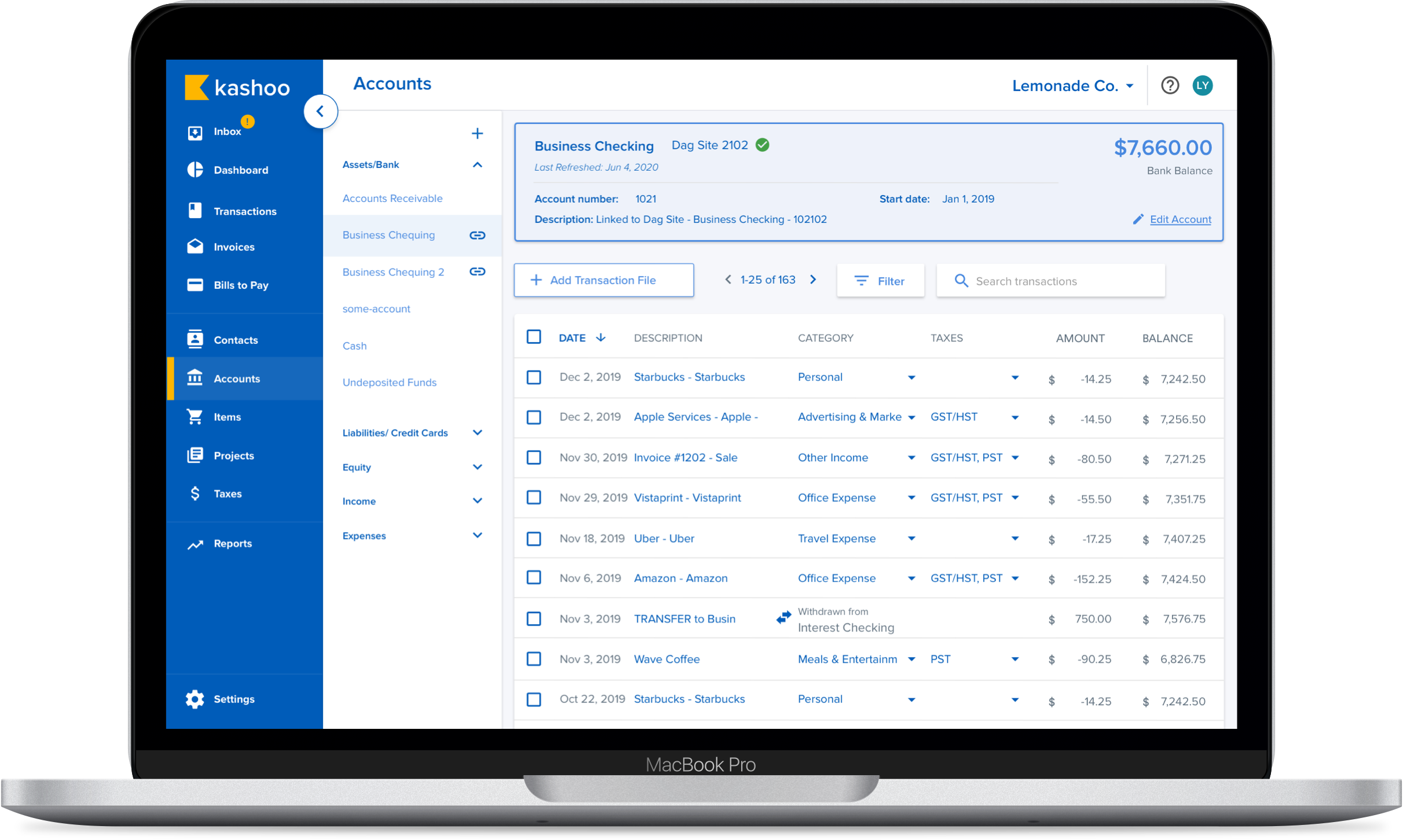
Kashoo Classic
While Kashoo Classic is a great product for accountants, the target audience for the Kashoo product shouldn't accountants. The competition with larger companies such as Quickbooks and Freshbooks is too difficult to compete with.
Issues with Kashoo Classic is as follows:
- When the user first enters into the software there is no sense of where to start.
- Not sure where to connect a bank account to.
- Too much flexibilities where it could affect someone’s books to be inaccurate.
- Too much show to the user which makes it hard to focus.
- All pages look alike making it confusing to the user making it easy to accidentally input the wrong type of data into the system.
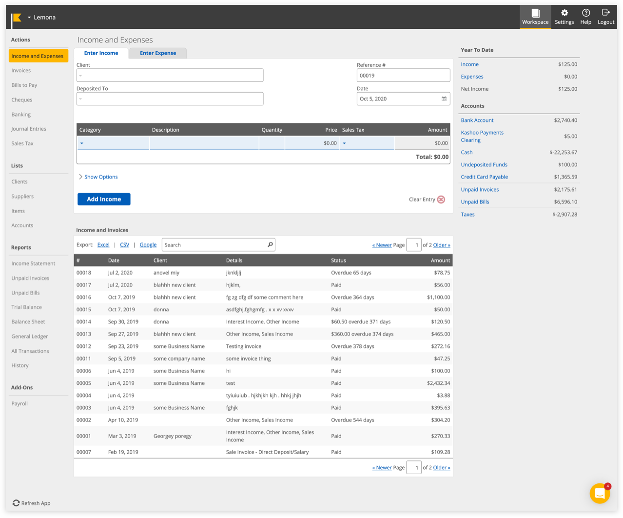
Kashoo 2.0
Prior to my start with Kashoo, an external design agency was hired to take on Kashoo 2.0 visually and experience-wise.
Overall Main Issues:
- Just like in Classic, theres too much information for the user to focus on.
- No clear direction of where to start.
- Hamburger menu on the left of the logo isnt that noticeable to minimize the side bar.
- Colours on the Dashboard are too light and hard for those who are impaired to see.
- Action buttons to the side are too faint and confuses users whether they can press it or not.
- The information just below the top header are hard to read and the information isn’t useful to the user.
- Different types of reports in the side menu can be grouped together as Reports instead of listing all.
Initial main inbox issues.
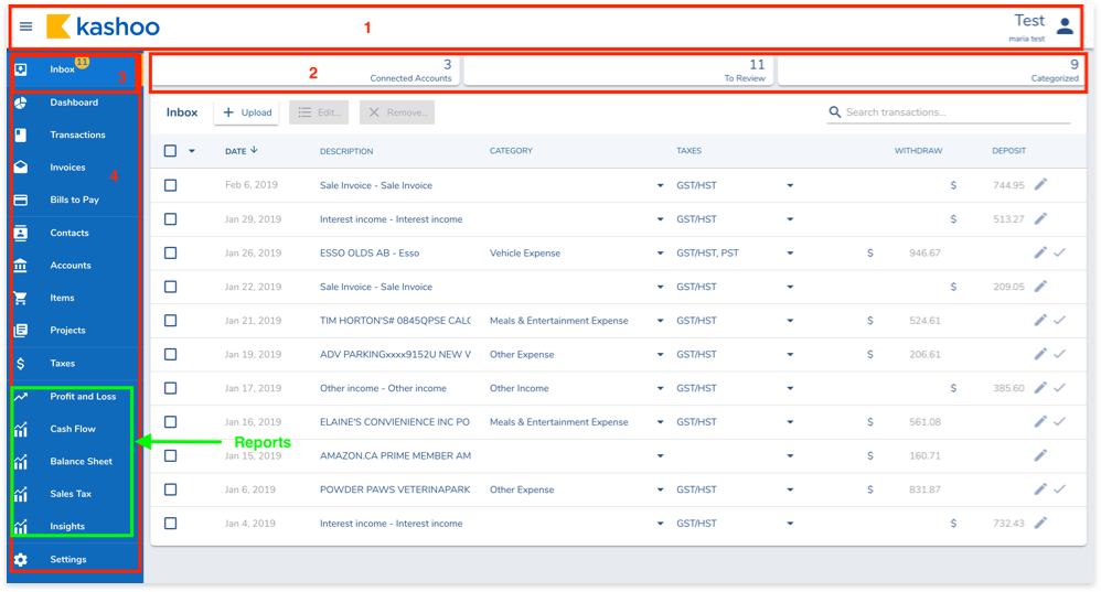
Few screens of initial look.
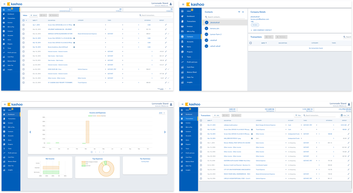
Finalized look & experience
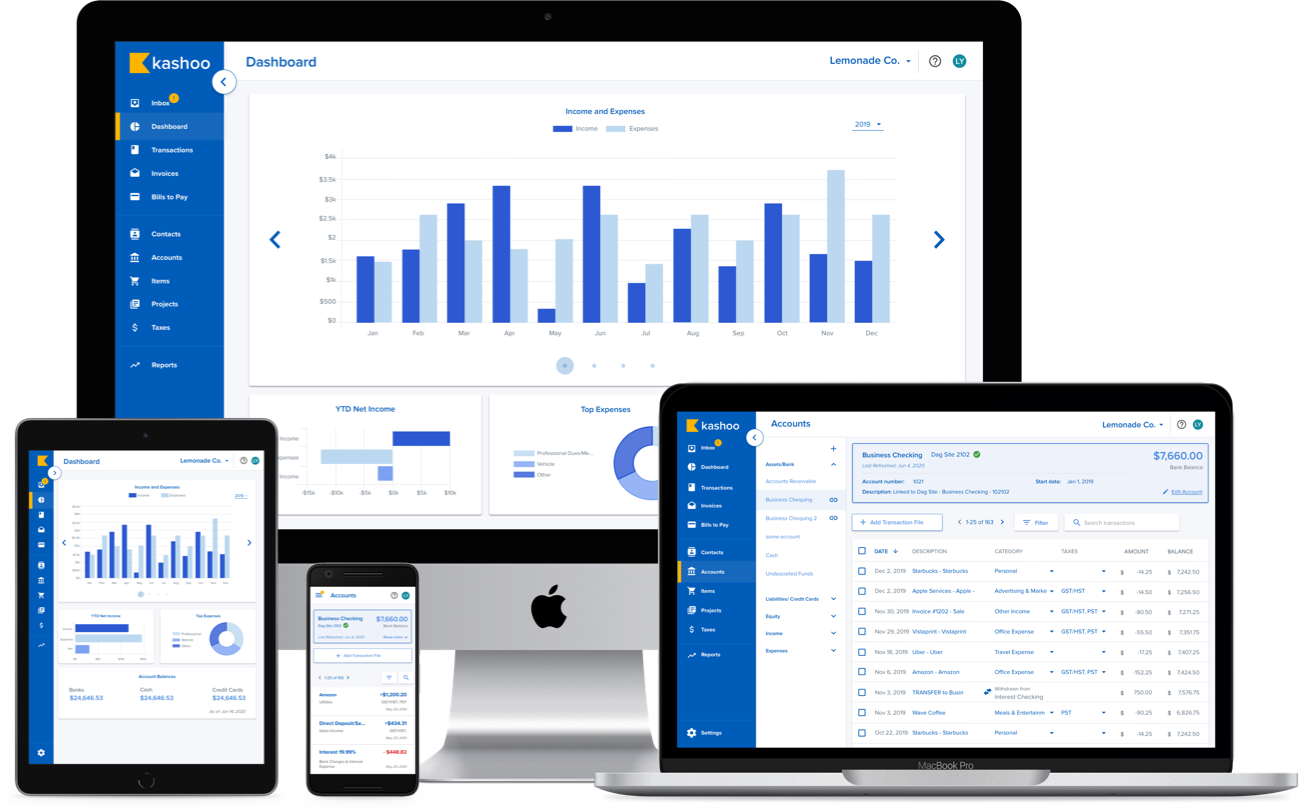
** Please note that some features I can only show what has already been released to the public
New Designs:
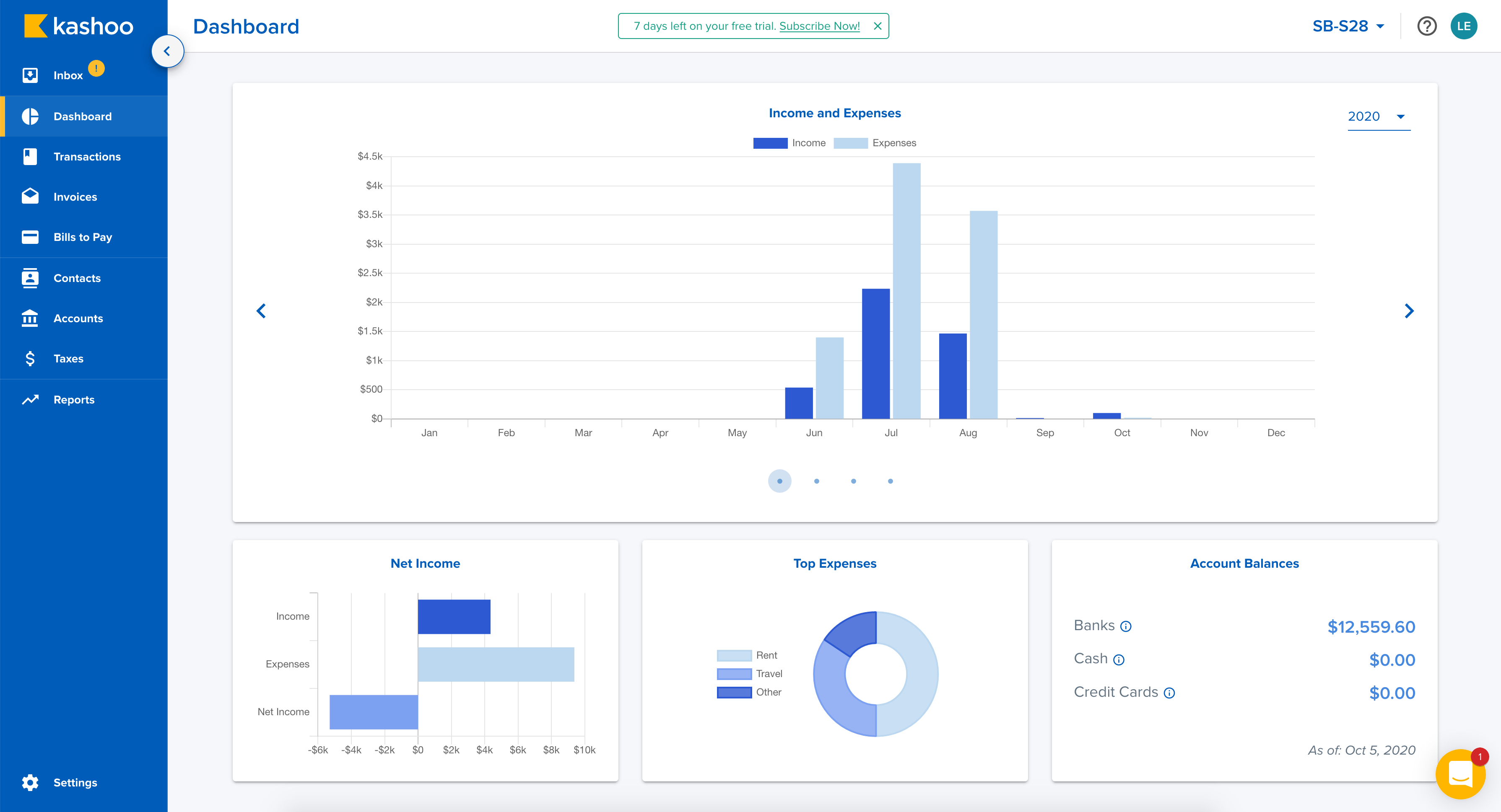
- As the lead designer, I consolidated all the colours in the initial 2.0 look which had over 15+ different shades of blue and narrowed it down to 2 main blues and 2 secondary shades of blue. It is more sharper and bold to the eyes. It’s also easier to differentiate whether an item is editable/non-editable/placeholder.
- Adding more whitespace - this helps the user to digest the app more easily. It’s easier to know where to focus and it’s not as cluttered.
- Colours are more accessible to those visually impaired.
- Easier differentiate each page visually.
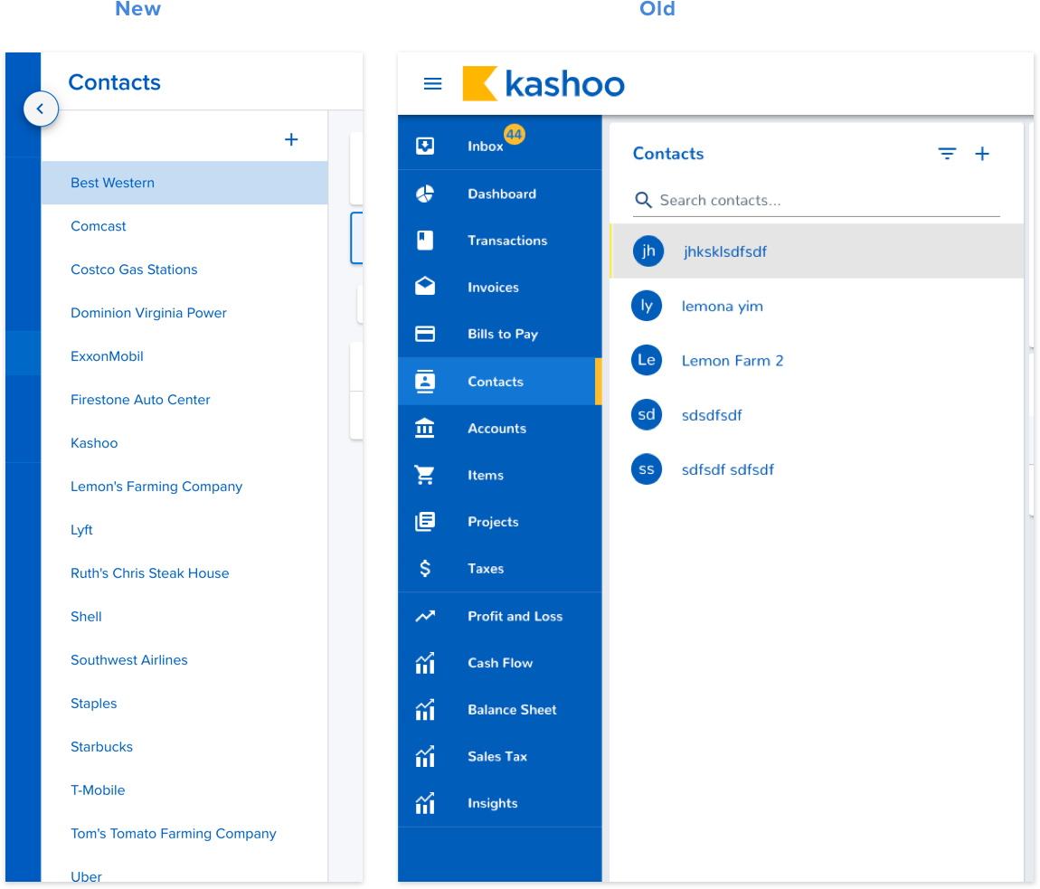
- Reduced unnecessary clutter. Ex. Icons in the submenu for Contacts and Accounts.
Better Experience:
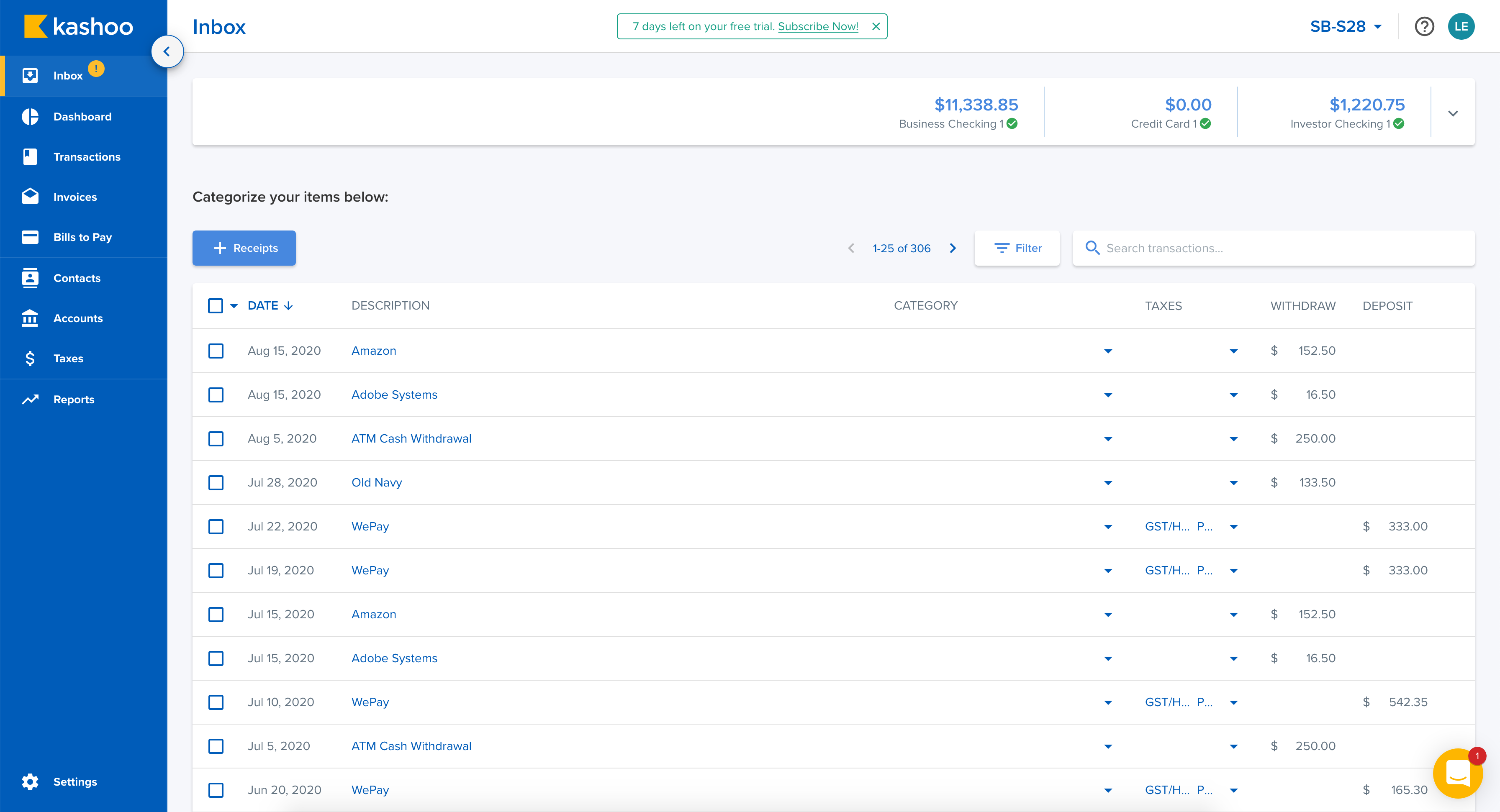
- With the integration with Yodlee, if a known Vendor or Client name is in the database of Yodlee, it auto-categorizes the items leaving the user only to confirm to post or, edit if it’s incorrect.
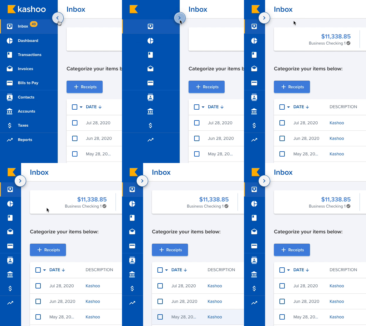
- Moving the button to minimize the side menu to a more noticeable place and have it to be more understandable rather than just a hamburger menu.
- Duplication and pre-saved contact information to create invoices or bills faster.
- Clear direction of what the user needs to do (categorize items then “post” to their books).

Clearly informs which item is read to be posted.

If no bank has been connected, it's obvious where to go.

Using the tabs help organize and filter through invoices and bills. The statuses for each item also lets users know when each are due through text and colour.

Overall
I believe that when the machine learning picks up and auto-categorizes and auto-posts the items, Kashoo 2.0 is a powerful contender for those who don't want to spend hours doing their accounting work or they then to do their taxes themselves.
If you'd like to experience the site yourself, Click Here

